Carbon for AI
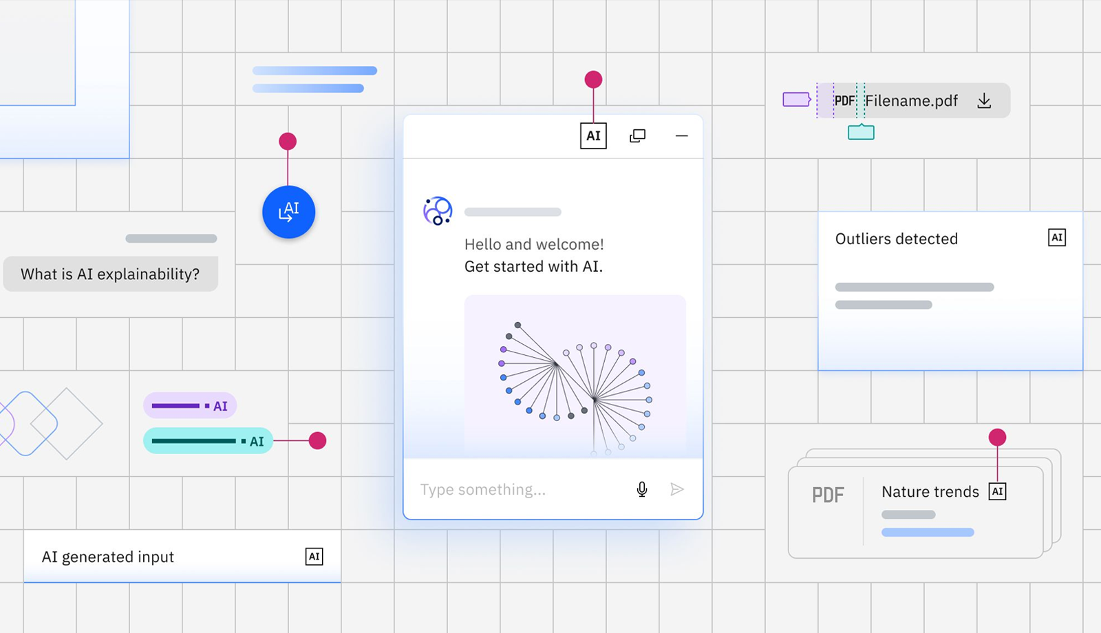
Carbon for AI is an extension of the Carbon design system that gives AI instances a visually distinct identity through light-inspired effects like gradients, glows, and brightness. Built on Carbon's core principles, it uses visual styling to identify AI-generated content while providing transparency and explainability pathways. The system includes new color tokens, AI variants of existing components, and specialized components like the AI label to ensure consistent AI identification across IBM's product ecosystem.
Summary
Provided technical oversight and review for Carbon for AI, a comprehensive extension to IBM's design system that uses light-inspired visual effects to identify AI-generated content. Managed the development process and provided architectural guidance on how gradient systems and new color tokens would integrate with existing Carbon infrastructure. Ensured the implementation maintained design system consistency and accessibility standards throughout the rapid development cycle that delivered full component coverage in just a few months.
Background
The Challenge: As AI became central to IBM's product strategy, users needed clear ways to identify AI-generated content across all IBM software. Without visual consistency, AI instances appeared differently across products, creating confusion and reducing trust. IBM needed a systematic approach that would work across hundreds of components while maintaining accessibility and brand consistency.
The Opportunity: Create an extension to Carbon that used "light as a metaphor to illuminate AI-generated content" while building transparency and explainability into the design system itself. This meant developing new visual language that was distinct yet harmonious with existing Carbon principles.
My Role: I served in a review and management capacity, overseeing the technical implementation process and providing guidance on architecture decisions. My involvement focused on ensuring the AI styling integrated properly with existing Carbon infrastructure and met our accessibility and consistency standards.
Approach
Design-Development Collaboration:
- Dev partnered closely with design through early prototyping phase to understand how gradient systems would work across multiple component types and themes
- Carbon devs built rapid prototypes to test visual concepts in real component contexts, validating design decisions against technical constraints
- Established feedback loops between design exploration and technical feasibility to ensure concepts could scale across the entire component library
Token Architecture & Visual System:
- Developed new suite of AI color tokens that integrated seamlessly with existing Carbon themes without requiring separate theme packages
- Implemented gradient and glow effects using CSS custom properties to ensure consistent light-inspired styling across components
Component Implementation Strategy:
- Built AI variants for core Carbon components using mix-in approach, allowing components to toggle between standard and AI styling without code duplication
- Integrated AI label component as consistent indicator across all AI-enhanced components, providing pathway to explainability through popover system
- Implemented revert functionality that allows users to toggle between AI-generated and manually edited content while maintaining state
Accessibility & Standards:
- Ensured all AI styling met Carbon's accessibility standards through contrast testing and screen reader validation
- Limited light spread and glow effects to maintain readability while preserving visual distinction
- Built AI transparency principles directly into component architecture, making ethical AI practices automatic rather than optional
Challenges
Visual Complexity vs. Performance: Implementing gradients, glows, and light effects across dozens of components while maintaining fast render performance required careful CSS optimization. Had to balance visual impact with technical constraints, especially for complex components like data tables with hundreds of cells.
Cross-Component Consistency: Each component type presented unique challenges for applying AI styling - from form inputs to modals to data tables. Ensuring the light-inspired effects felt cohesive across such different interaction patterns required extensive iteration and testing.
Accessibility with New Visual Language: Creating visually striking effects that remained accessible was challenging. The gradient and glow effects needed to enhance rather than interfere with contrast ratios, keyboard navigation, and screen reader accessibility.
Theme Integration: AI styling needed to work across Carbon's light, dark, and high-contrast themes without breaking existing implementations. This required careful token architecture that extended rather than replaced existing color systems.
Rapid Timeline with Quality Standards: Delivering full component coverage in just a few months while maintaining Carbon's quality and accessibility standards required efficient prototyping workflows and close design-development coordination throughout the process.
Outcomes
Comprehensive Component Coverage:
- Delivered AI variants for all core Carbon components including forms, data tables, modals, and navigation elements in just a few months
- Created consistent AI identification system that works across React and Web Components libraries with identical visual and behavioral patterns
- Built reusable architecture that allows teams to easily add AI styling to custom components using established token system
Design System Integration:
- Successfully integrated AI styling into existing Carbon themes without breaking changes, allowing teams to adopt AI components incrementally
- Established design-to-code workflow where designers can toggle AI variants in Figma and developers can implement using the same variable system
- Created sustainable token architecture that maintains consistency as new AI components and patterns are added
Accessibility:
- All AI components meet Carbon's accessibility standards with tested color contrast and screen reader compatibility
- Built AI transparency and explainability directly into component architecture through integrated AI label and popover system
- Established visual language that clearly distinguishes AI content while maintaining usability and aesthetic harmony with base Carbon components
Technical Foundation:
- Created reusable pattern for extending design systems with specialized visual languages while maintaining consistency and accessibility
- Demonstrated rapid prototyping workflow that bridges design exploration with technical implementation at enterprise scale
- Positioned IBM as leader in ethical AI presentation through systematic approach to transparency and explainability in user interfaces